Spring Color Palettes That Instantly Refresh Your Home
Introduction
Spring is the perfect time to reset your home. Longer days, brighter light, and a shift in mood all call for lighter, fresher interiors. One of the fastest ways to refresh your space—without a full renovation—is by updating your color palette.
In this guide, you’ll discover 7 spring color palettes that instantly make any home feel brighter, calmer, and more inviting. Each palette includes styling tips, room ideas, and simple ways to update your decor using affordable accessories.
Why Spring Color Palettes Matter
Color affects mood more than most people realize. Spring palettes are designed to:
- Reflect natural light
- Create a sense of openness
- Make rooms feel cleaner and calmer
- Refresh a space without buying new furniture
Even small updates—pillows, curtains, wall art—can completely change how your home feels.
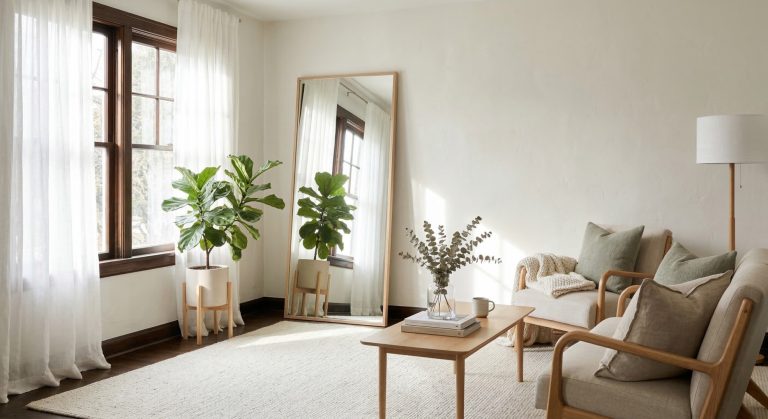
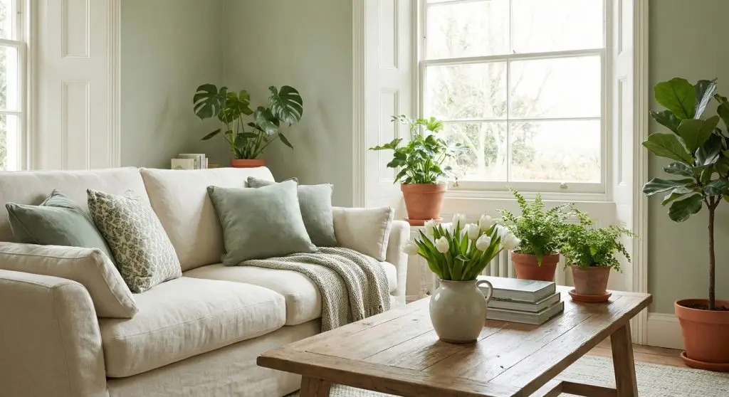
1.Sage Green + Cream + Soft Wood
Best for: Living rooms, bedrooms, calm spaces
Sage green is one of the most popular interior colors right now—and for good reason. It brings a subtle connection to nature while staying neutral and timeless.
How to use it:
- Cream walls or sofas
- Sage green cushions, throws, or curtains
- Light wood furniture or accents
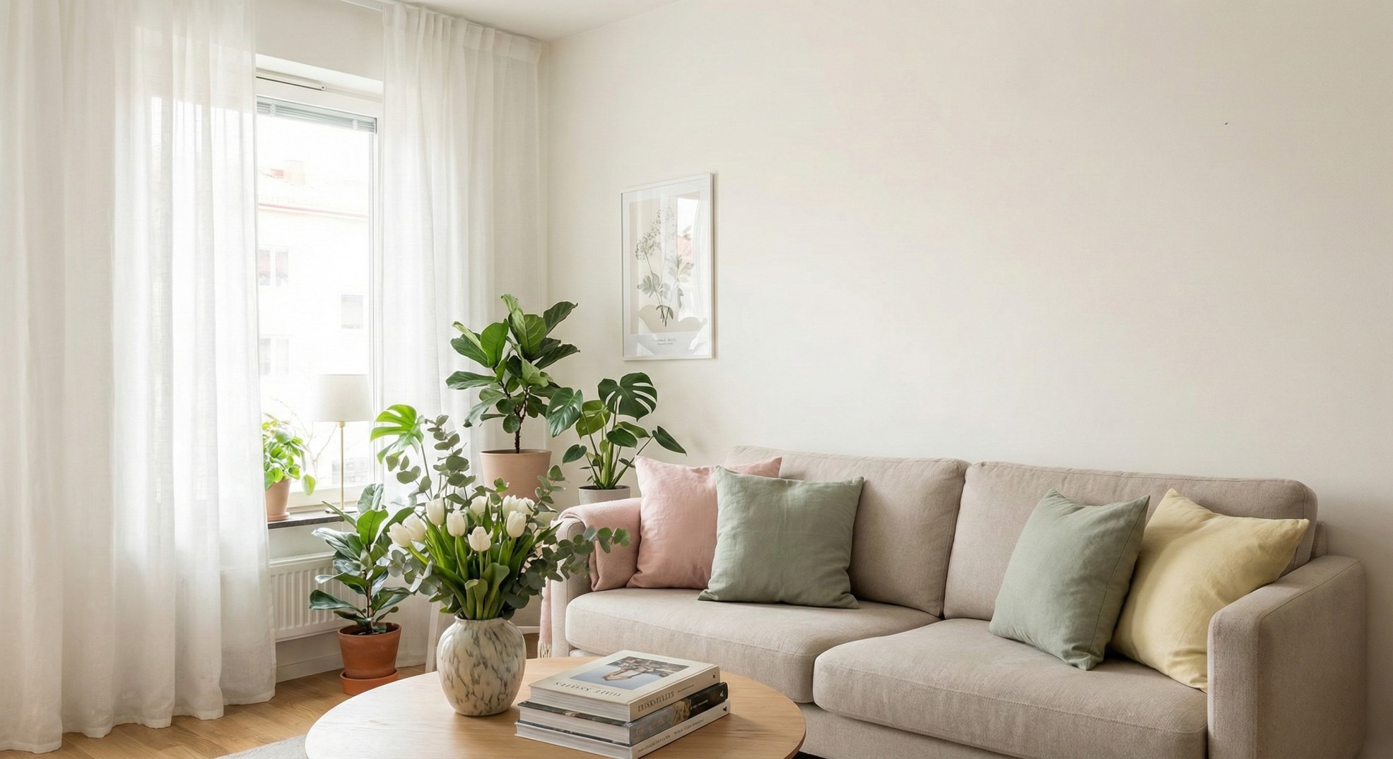
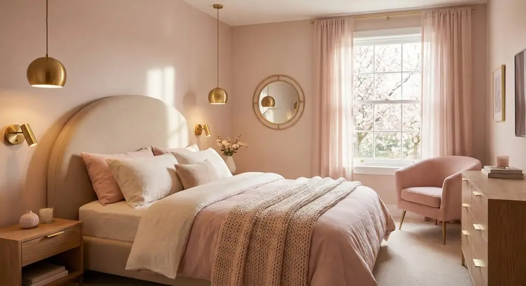
2.Blush Pink + Warm Beige + Gold Accents
Best for: Bedrooms, feminine spaces, small apartments
Blush pink adds warmth without feeling childish. When paired with beige and gold, it feels elegant and modern.
How to use it:
- Beige walls or bedding
- Blush pillows or wall art
- Gold lamps, mirrors, or trays
This palette works beautifully in small spaces because it reflects light and softens harsh corners.
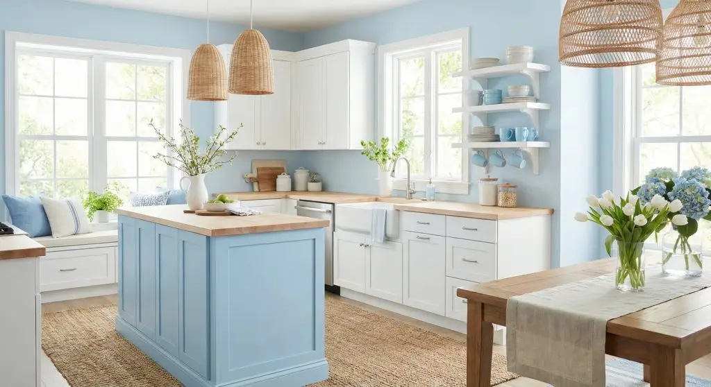
3.Sky Blue + White + Natural Textures
Best for: Bathrooms, kitchens, coastal-inspired homes
Sky blue instantly feels clean and refreshing—perfect for spring.
How to use it:
- White base (walls, cabinets, tiles)
- Sky blue towels, dishes, or artwork
- Woven baskets or rattan accessories
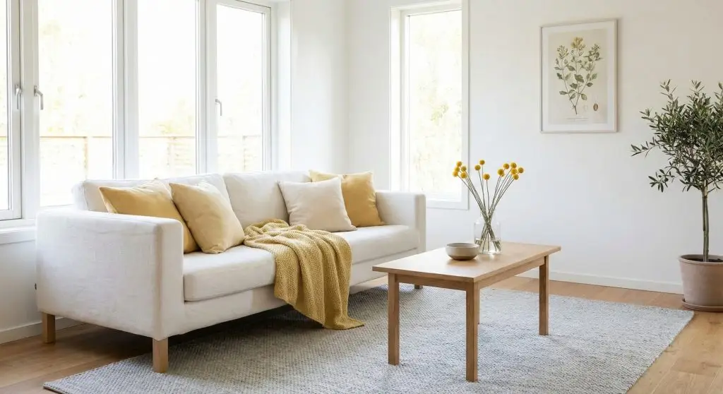
4.Soft Yellow + White + Light Gray
Best for: Dark rooms, north-facing spaces
Yellow brings joy and warmth—exactly what spring is about. The key is keeping it soft, not bold.
How to use it:
- White walls or sofas
- Soft yellow cushions or flowers
- Light gray rugs or furniture
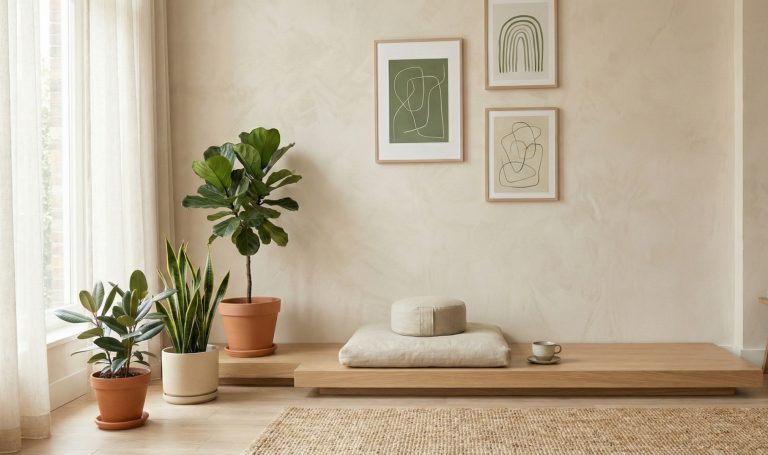
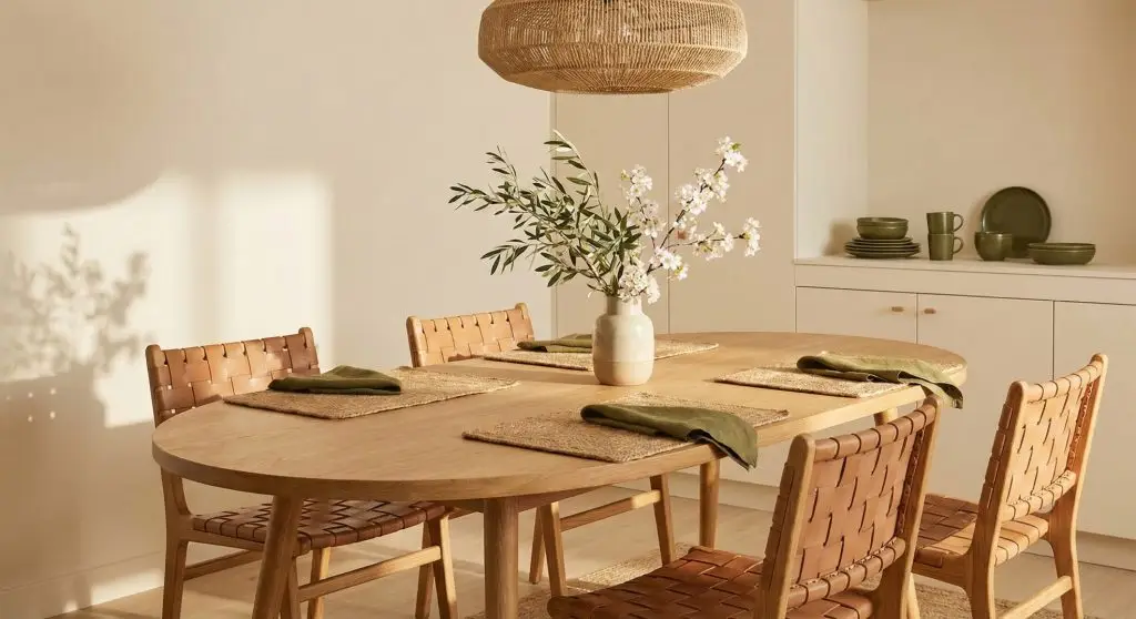
5.Olive Green + Warm Neutrals
Best for: Dining rooms, modern homes
Olive green feels grounded and sophisticated. It’s perfect if you want a fresh look without going too light or pastel.
How to use it:
- Olive chairs or textiles
- Beige walls or table linens
- Ceramic or stone decor
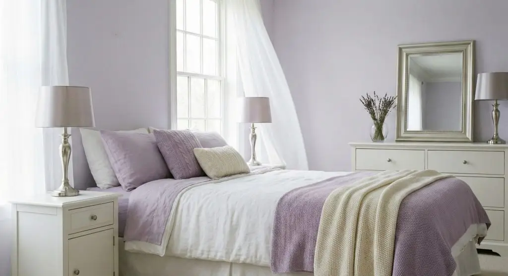
6.Lavender + White + Silver
Best for: Bedrooms, relaxing corners
Lavender is soft, calming, and trending again—especially for spring.
How to use it:
- White bedding or walls
- Lavender cushions or candles
- Silver frames or lamps
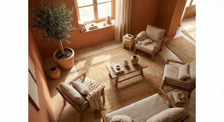
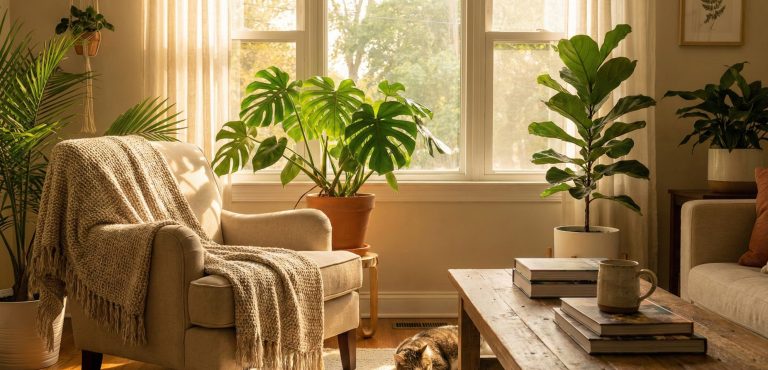
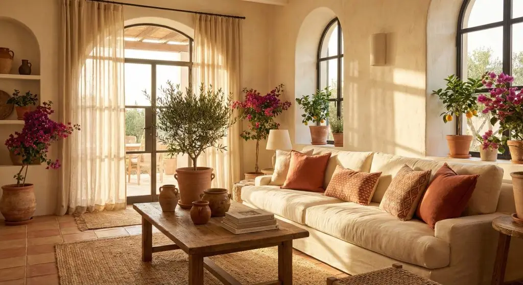
7.Terracotta + Cream + Greenery
Best for: Mediterranean or earthy interiors
Terracotta brings warmth and character to a space, while cream tones and natural greenery keep the look light, balanced, and timeless. This palette works especially well in Mediterranean-inspired homes and interiors that focus on texture and natural materials.
How to use it:
- Terracotta pots, cushions, or decorative accents
- Cream walls, sofas, or textiles
- Plenty of indoor plants for freshness and contrast
👉 For a deeper look at this style, explore Terra Cotta & Mediterranean-Inspired Indoor Interiors: Warmth, Texture, and Timeless Style, where we break down how to use terracotta, layered textures, and earthy tones to create a timeless Mediterranean feel.
Final Thoughts
Spring color palettes are about feeling lighter, calmer, and more refreshed at home. Whether you prefer soft pastels or earthy tones, the right palette can completely change your space—without stress or big spending.
Start small. Choose one palette. Let spring in.